Other Visualization Tools: Streamlit
Introduction
Data visualization tools are software programs that display information in visual formats such as graphs, charts, or heat maps to facilitate data analysis. These tools help interpret and work with large volumes of information. With proper data visualizations, it is possible to make informed decisions without wasting time converting raw data into an understandable format, as the software performs this process automatically, highlighting only the most relevant data.
There are various data visualization tools, varying in complexity. Some are designed to be simple and easy to use, while others are more sophisticated and require advanced technical knowledge. However, the main purpose of all of them is the same: to make data more understandable and facilitate decision-making based on it.
Data visualization tools have the potential to democratize data analysis, making it accessible to almost anyone in an organization. Areas such as marketing, finance and human resources, among others, can benefit from these tools to interpret and manage large volumes of data, both internal and external. By making data more understandable to everyone within the organization, you encourage informed decision making, identifying patterns, increasing efficiency, and gaining new insights.
Streamlit
Streamlit is an open source Python-based application framework that makes it easy to create visual applications without requiring prior knowledge of front-end development. This eliminates the need to work with front-end frameworks or code in HTML, CSS, and JavaScript. Streamlit enables application development in a simple and efficient way, integrating with various libraries for applications in fields such as remote sensing and data science.
While Streamlit is not ideal for those programming Python scripts that run in an automated environment with tools like cron, it is very useful for those who want to create interactive tools to share with other team members. For example, it can be used to develop keyword research applications. One of its main advantages is the ability to generate attractive interfaces with a minimum of code.
The framework is designed primarily for data-oriented applications, offering native integration with libraries such as Pandas to work with dataframes and with visualization tools such as Matplotlib. This allows data to be presented in a clear and visually attractive way. With Streamlit, everything from simple interfaces to graphics, buttons, sliders and other interactive functionality can be created, making it easy to develop interactive applications with just a few lines of code.
Example
First, we need to install Python in our system and Visual Studio Code

We add the address in the path in the environment variables

In cmd, we enter the command to see the version of Python we installed. Then, we use the command to install the "Streamlit" library

On the Streamlit website we must connect with our Github account, granting all permissions.

We must create a repository for our project.

Then we update the Python libraries

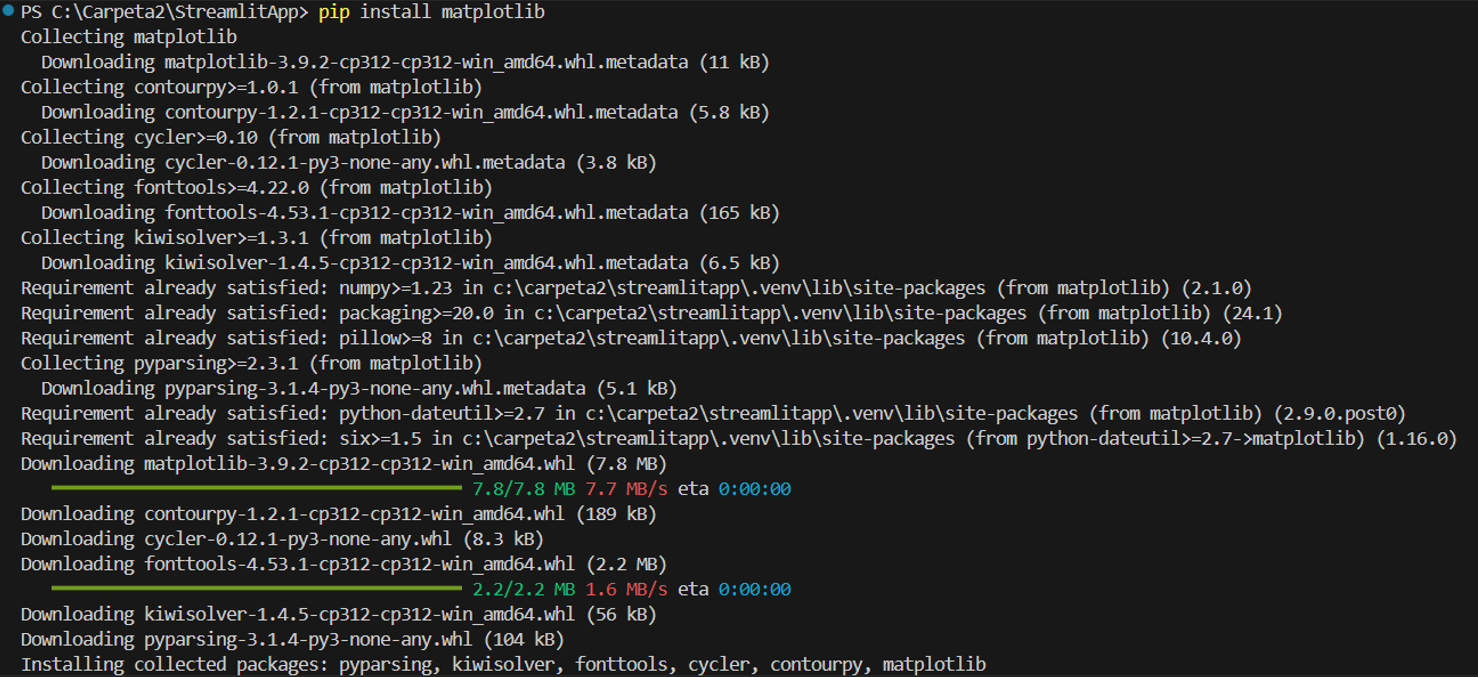
Then we install matplotlib
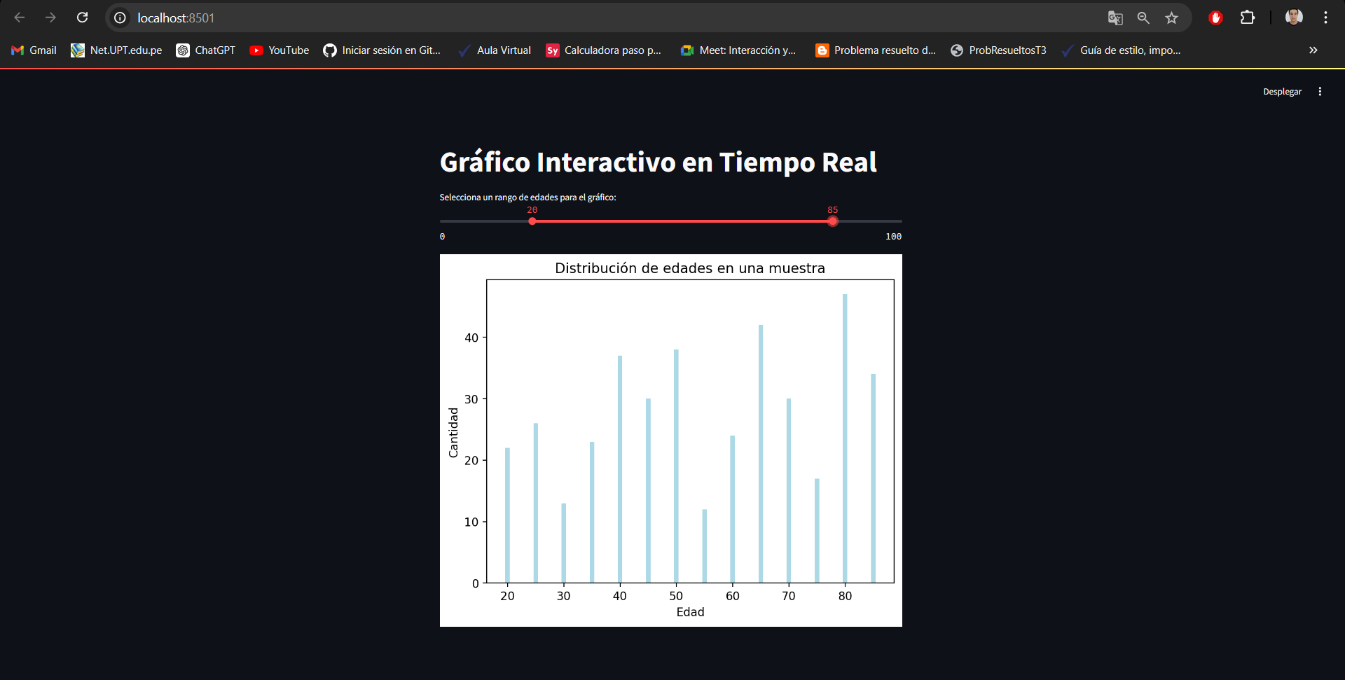
Next, we create our Python project, which is a real-time age visualization graph
import streamlit as st
import pandas as pd
import matplotlib.pyplot as plt
import numpy as np

# Application Title
st.title('Real-Time Interactive Chart')

# Slider to select an age range for the graph
age_range = st.slider('Select an age range for the graph:', 0, 100, (20, 40))

# Generate ages based on selected range
ages = list(range(age_range[0], age_range[1] + 1, 5))

# Generate the list of quantities dynamically so that it has the same length as ages
# In this example, we generate random quantities to illustrate
quantities = np.random.randint(10, 50, size=len(ages))

# Data for the dataframe
data = {
    'Age': ages,
    'Quantity': quantities
}

# Create the DataFrame
df = pd.DataFrame(data)

# Create and display bar chart dynamically
fig, ax = plt.subplots()
ax.bar(df['Age'], df['Amount'], color='lightblue')
ax.set_xlabel('Age')
ax.set_ylabel('Amount')
ax.set_title('Age distribution in a sample')

# Show the graph in Streamlit
st.pyplot(fig)
Next, we install the Streamlit library in the Python environment. When finished, we must upload our project to the Github repository.

And finally, we connect our repository to the Streamlit website and run it.
Conclusion
Streamlit is a tool that stands out for its ease of use, allowing the creation of interactive web applications using only Python. No advanced knowledge of web development is required, making it an ideal choice for data scientists, machine learning engineers, and analysts who want to focus on their work without worrying about the complexity of the user interface. Its simple syntax and direct integration with Python facilitate rapid prototyping and interactive data visualization.
Streamlit improves collaboration between teams by allowing the creation and deployment of web applications that can be easily shared, even with non-technical users. This encourages better communication of results and facilitates data-driven decision making, as all team members can interact with the applications and explore results intuitively.
Bibliography
Data visualization tools. (2020, junio 23). Treasure Data. https://www.treasuredata.com/glossary/what-are-data-visualization-tools/
Simplilearn. (2020, octubre 20). 23 best data visualization tools you can’t miss! Simplilearn.com; Simplilearn. https://www.simplilearn.com/data-visualization-tools-article
López, B. R. (2022, septiembre 21). Qué es “Streamlit”. Cursos GIS | TYC GIS Formación; TYC GIS. https://www.cursosgis.com/que-es-streamlit/
Navarro, S. (2023, marzo 13). Crear una interfaz en Streamlit. KeepCoding Bootcamps. https://keepcoding.io/blog/crear-una-interfaz-en-streamlit/
- YouTube. (s/f). Youtu.Be. Recuperado el 20 de agosto de 2024, de https://youtu.be/-IyA_Yvs8IQ?si=0S6UyY0G0K3B_KFq